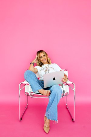
My Go-To Resources for Designing a Beautiful, Professional Website
My Resources
One of the questions I hear often is some version of: “Where do you find all of this stuff? The truth is, a beautiful website rarely comes from one resource. It’s usually a combination of great photography, thoughtful typography, a cohesive color palette, useful tools, and most importantly a clear vision for how everything should work together. These are some of the resources and tools I return to again and again when designing websites.
Squarespace
Naturally, we’ll start here. Squarespace is the platform I design my custom websites, semi-custom websites, and website templates around because I love the balance between creative freedom and usability. A website shouldn’t require you to call a developer every time you want to change a photograph or update a paragraph. For many creative and service-based businesses, Squarespace gives you enough design flexibility to create something highly customized while still making the finished website manageable for the business owner and that’s important to me. A website shouldn’t only look good on launch day. You should be able to actually use it afterward.
Canva
Canva has become one of those tools that can play as small or as large a role in your business as you’d like. I use it as a supporting design tool for things like brand graphics, social media content, simple visual assets, mood boards, and design exploration. It’s also incredibly helpful for business owners who don’t necessarily consider themselves designers. The biggest advice I can give you with Canva? Resist the urge to use everything. You don’t need six fonts, twelve graphic elements, three different styles of photography, and every trending effect. A restrained design almost always feels more sophisticated.
Stock Photography
Photography can completely transform the personality of a website. When I’m sourcing imagery, I’m looking for more than an individually beautiful photograph. I want to know how the images work together. Does the lighting feel consistent? Do the colors complement one another? Does the photography feel editorial, sophisticated, playful, minimal, romantic, bold, or modern? Your website imagery should feel as though it belongs to the same visual world. Creating moodboards in Canva and Pinterest really help me organize my thoughts and decide what I do or do not want.
My Favorite Paid Stock Photography Resources
The Vault Stock Studio
A beautiful resource when I’m looking for elevated, brand-forward imagery that feels more curated than traditional stock photography. It’s especially useful for creating sophisticated websites where the photography needs to contribute to the overall aesthetic.
Adobe Stock
Adobe Stock is one of my go-to resources when I need a large selection and very specific imagery. Because the library is so extensive, it’s particularly helpful when I already have a clear concept in mind and need to find an image that fits it.
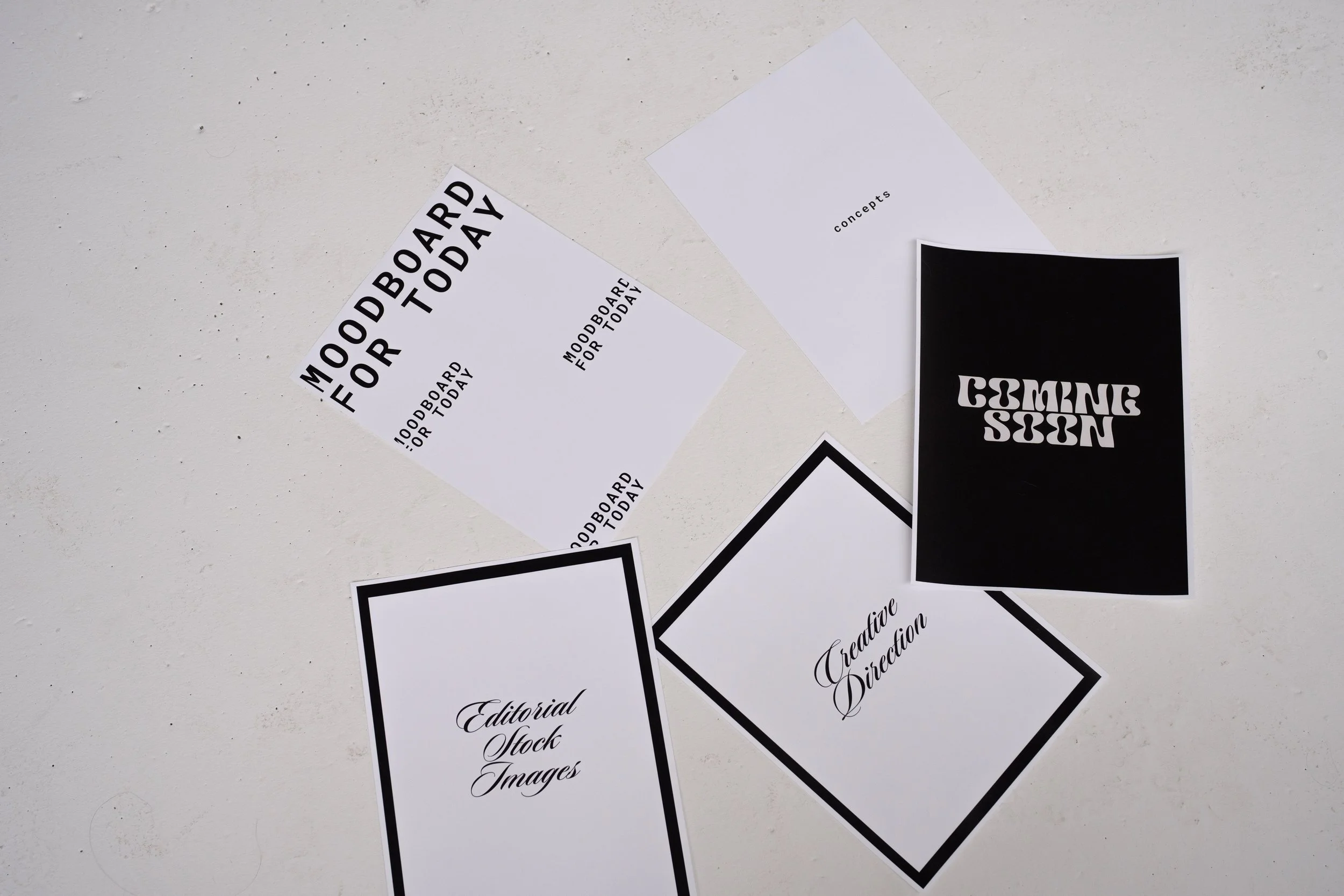
Editorial Stock Images (ESI)
For brands that need something a little less traditional, I love exploring editorial-style stock imagery. ESI is a great resource when I’m creating a website that needs a fashion-forward, modern, or magazine-inspired feel.
Death to Stock (DTS)
Death to Stock is another favorite when I want photography that feels creative, artistic, and unexpected. The imagery tends to have a strong point of view, making it especially useful for brands that want their website to feel distinctive rather than overly polished or predictable.
My Favorite Free Stock Photography Resources
Pexels
Pexels is one of my favorite places to start when a project doesn’t have a photography budget. There’s a huge selection of free imagery across a wide range of styles, and with a little digging, you can find some incredibly beautiful photographs.
Unsplash
Unsplash is another excellent free resource, particularly when I’m searching for lifestyle, interiors, travel, architecture, beauty, or atmospheric imagery. I tend to search beyond the first few results to find photographs that feel a little less recognizable as stock.
A Note About Stock Photography
Whether you’re using free or paid stock photography, always check the current license for the individual resource and intended use. This becomes especially important if you’re a designer creating websites, templates, digital products, or anything that will be sold or redistributed. A license that allows you to use an image on your own business website doesn’t necessarily give you permission to include that image in a product you’re selling to someone else. And remember: good stock photography is really about curation. You don’t need dozens of images. A smaller collection of photographs with consistent lighting, coloring, composition, and mood will almost always create a more elevated website.
“The best creative resources don’t replace your vision—they give you more ways to bring it to life.”
Pinterest is one of my favorite places to begin the visual exploration process. Not necessarily to copy a specific design, but to discover patterns, save interiors, look at magazine covers, packaging, fashion editorials, typography, restaurants, hotels, architecture, and websites. Then look at everything you’ve saved together and you’ll often start noticing recurring themes. Maybe you’re continually choosing warm neutrals. Maybe everything has dramatic serif typography. Maybe you keep saving black-and-white photography with one unexpected pop of red. Those patterns are clues. They’re helping you identify your visual language. You can also develop very specific ideas about what you don’t want. Play around with different moodboards and themes on pinterest. They are the best way to gather your thoughts and begin honing in on your specific art direction.
Font Resources
Typography is one of the fastest ways to make a website feel completely different. A dramatic serif can make something feel editorial. A clean sans serif can introduce modernity. A delicate script can add personality, but font selection isn’t just about choosing beautiful typefaces. It’s about creating a font system. Typically, I want clear roles for my fonts: headings, body copy, buttons, and possibly an accent style. The fonts should complement each other rather than compete with one another and readability always wins. If your beautiful paragraph font is difficult to read, it isn’t doing its job. Creative Market is my go-to source for unique, high-quality fonts, but there are plenty of other excellent foundries and marketplaces worth exploring. Some of my favorites include:
AI Tools
AI has absolutely earned a place in my resource library,but I think it works best as an assistant rather than an art director. It can help brainstorm headlines, organize ideas, create content outlines, explore SEO topics, troubleshoot problems, or get you unstuck when you’re staring at a blank page. What it can’t replace is your taste,your perspective, and your experience with your clients. It cannot develop a deep understanding of your brand. The best results usually happen when you bring the direction and use AI to help you execute it.
My favorite AI tools are:

Education & Learning
Beautiful design is only part of building a successful website or brand. I’m also a big believer in continuing to learn whether that means sharpening my design skills, understanding a platform more deeply, or finding better ways to create an experience for my clients.
These are a few of my go-to educational resources:
Standout Squarespace
Standout Squarespace is my top resource for continuing education around Squarespace. From learning more about the platform to discovering new ways to customize and elevate a website via Custom CSS and Javascript, it’s a resource I turn to when I want to expand what’s possible within Squarespace. As a designer, I think staying curious about the platform you work in is incredibly important. Squarespace continues to evolve, and there’s always another technique, feature, or creative approach to discover.
Standout Shopify
For ecommerce education, I also use Standout Shopify. Shopify has its own ecosystem, terminology, tools, and design considerations, so having a dedicated educational resource is incredibly helpful, especially when working with businesses whose websites are centered around selling products online. Even when Squarespace is my primary design platform, understanding other platforms makes me a better designer and helps me think more strategically about what different businesses actually need.
Drop Cap Design Academy
For branding education, Drop Cap Design Academy is another resource I love. A beautiful website starts long before you begin laying out pages. Understanding typography, color, visual identity, brand direction, and how all of those elements work together creates a much stronger foundation for the finished design. Continuing to develop my branding skills also helps me look beyond individual design choices and think about the bigger picture: Does this feel cohesive? Does it communicate the right personality? Does it actually feel like the brand?
Never Stop Learning
One thing I’ve learned about working in a creative industry is that you’re never really finished learning. Platforms change, design trends evolve, new technology arrives, and sometimes you simply discover a better way of doing something you’ve done a hundred times before. I don’t think the goal is to know everything. It’s to stay curious, keep developing your eye, and continue adding new skills to your creative toolbox.